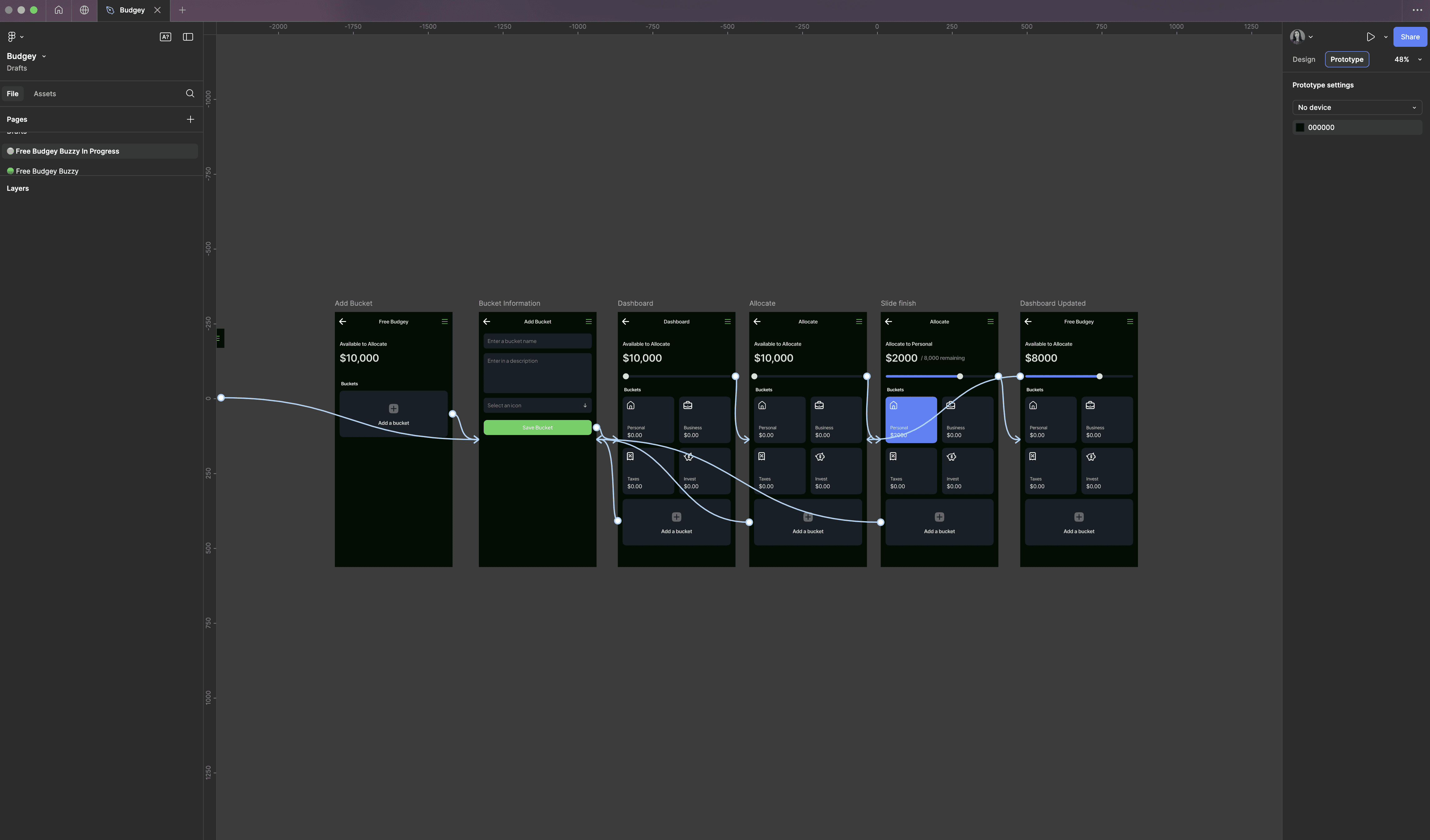
We all love Figma. It’s collaborative, modern, and lets designers prototype experiences faster than ever. The problem is, what looks pixel-perfect in Figma can turn into a production horror show once it hits code.
Last quarter, our team learned this the hard way. We took a slick, beautifully polished Figma design for a new onboarding flow — and watched it turn into a stress-fueled rollout full of regressions, conflicts, and user frustration.
Here’s exactly what went wrong — and how you can avoid repeating our mistakes.
The Setup
Our product team wanted to redesign onboarding with:
✅ modern responsive layouts
✅ consistent typography
✅ accessible color palettes
✅ a reusable component model
Figma made it look amazing. We reviewed the designs, signed off with stakeholders, and everyone was confident.
But then we had to build it.
Where It All Broke
1️⃣ Ambiguous Interactions
Figma showed hover states, but no rules for click, focus, or keyboard navigation. So devs guessed how accessibility behaviors should work — and guessed differently.
Result: broken tab navigation, inconsistent button focus, poor screen-reader support.
2️⃣ Undefined Edge Cases
The Figma prototype had happy-path data only. In the real app, long user names, missing profile images, and translated text broke layouts completely.
Example: a user with a 64-character name destroyed the welcome screen in production.
3️⃣ Conflicting Tokens
Figma showed colors labeled “primary” and “secondary” but our Tailwind token map didn’t match. So engineers hard-coded new colors, breaking the design system.
Result: components looked fine in isolation but clashed across the app.
4️⃣ Lack of Component Definitions
In Figma, everything looked like a button — but which were primary, secondary, ghost, or destructive? There was no documented hierarchy.
In code, we ended up with four “submit” buttons styled differently on different screens, each conflicting on hover, focus, and dark mode.
5️⃣ Handoff Black Hole
Designers dropped the Figma file, tagged the ticket “ready for dev,” and left. Engineers built what they thought was right. Nobody ran a proper walkthrough or cross-check.
Result: rounds of bug fixes and conflicts, weeks of cycle time wasted, and frustrated product owners.
How We Fixed It
After shipping a deeply flawed onboarding flow, we stepped back and rebuilt our Figma-to-code pipeline with these changes:
✅ Design Reviews with Engineering
Instead of a signoff after design, engineers reviewed prototypes with designers.
Edge cases (long names, missing data, translations) were explicitly discussed.
✅ Token Mapping Sessions
We aligned Figma’s design tokens with Tailwind variables.
Added a documented mapping sheet:
primary = bg-blue-600secondary = bg-gray-400etc.
✅ Component Contracts
Documented props, states, and accessibility rules in Storybook.
Every Figma button now maps 1:1 to a coded React component, with examples for disabled, focus, hover, and keyboard nav.
✅ Handoff Rituals
Designers demo their Figma prototype to devs
Devs ask clarifying questions
Agreement on breakpoints, spacing, token values is signed off
Only then do we tag it “ready for dev”
✅ Edge Case Playbook
We built a test matrix for:
names up to 128 characters
missing images
RTL languages
high-contrast themes
Lessons Learned
⭐ A beautiful Figma file is worthless without real engineering conversations.
⭐ Edge cases will always break pixel-perfect happy paths.
⭐ Token consistency is not “just design”; it’s a contract between teams.
⭐ Accessibility needs explicit, shared rules — not best guesses.
⭐ A 10-minute Figma walkthrough can save 10 weeks of churn.
Final Thoughts
Design and code aren’t separate. They live together in the user’s experience.
If you’re about to ship a big Figma-driven redesign, don’t repeat our onboarding nightmare. Pair with your designers, define the specs precisely, and agree on how every single state should behave — before you write the first line of code.
Because building beautiful, accessible, reliable UI is not about the perfect Figma frame. It’s about collaboration, from sketch to ship.
NEVER MISS A THING!
Subscribe and get freshly baked articles. Join the community!
Join the newsletter to receive the latest updates in your inbox.